
Decrease cognitive load
UX Researcher | UX Lead
The unknown
We didn’t know how to decrease our drop off rate on the register, login and password reset screens. These screens are vital to the business as this is where we capture our customer's details, market to them and keep them engaged with our service.
I was the UX Researcher for a FinTech lending company working with product delivery, customer experience and developers working together to enhance the current registration experience.
The goal: decrease cognitive load by creating short and easy forms which incentives users to start the journey.

What we know to be known
I started my research with introducing best practices on terminology, visual fixations on forms, fields, labels, simplifying forms, the relationship between register and log in and lastly the ugly beast of our generation — passwords.

Current Registrations screen — high cognitive load, long forms user expectation is that rest of the application would be long.
How does terminology play a role in scalability?
Focusing first on the registration screen as this is the most important screen to convert users into customers. Make a good first impression and users would reward you for that.
Register? Sign Up? Create Account?
They all mean the same thing but are perceived differently.

Using the term “Register” is clear, short and self-explanatory. Register also works well with “Log in” or “Sign In” whereas “Sign Up” and “Sign In” might cause confusion.
The clear winner for to use alongside Login is Register
Visual fixations on forms, fields and labels
The main goal of any screen is to reduce cognitive load and it’s especially important when you need to collect information from users.
On the current “Register” screen users spent on average 2 minutes completing the form with a bounce rate of 39%. From this, we can deduce that almost 40% users just “see” this screen and don’t like what they see while the others take +- 2 minutes to register before even starting the journey.
Keep in mind users might also take longer to complete forms if they keep the tab open when there is information they don’t have with them at the time. Ideally on registration users should know this off by heart.

Results
There is currently 22 visual fixations and 3 visual directions. Labels above input fields have fewer visual fixations than labels next to the input fields.
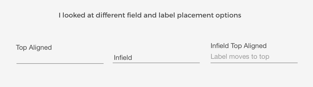
1. Top-aligned is easy to read but use more space before user input.
2. Infield is easy to read but hard to remember the label as it disappears after input
3. Infield top aligned is easy to read and the user can see both label and input.
Infield top alignment labels are adaptive placeholder text which decreases visual fixations, users see label and input at the same time. Once the user completed the form the user can scan the fields and see both the label and input, each field now can be processed quicker.
The clear winner for us is Infield Top Aligned labels
Simplifying forms
I started this one with the famous quote of Albert Einstein.
Everything should be made as simple as possible, but not simpler. - Albert Einstein
First things first only ask information which is vital for the user to continue. Reducing the number of fields is the first step in making your form simpler. Secondly, use the right type of fields, use radio buttons opposed to drop-downs when you have only two options don’t forget about toggle switches or date pickers.
Tip: Remember to use the HTML5 type attributes for inputs — to enable email input friendly keyboard on a mobile or numerical keyboard for numbers input types.
The relationship between register and log in
Whilst focusing on the registrations screen we detected an increase of returning customers completing the registration screen instead of logging in.

The current screen does not clearly indicate to log in if you are a returning customer. This interaction leads to a re-design of the option to login in if you are a returning customer.
The Password
Passwords are possibly the worst thing that came with the growing internet. Unfortunately, we can’t get away with some sort of verification
Currently, there is an option to confirm the password by re-typing your password. The problem is both fields are masked and the user still input their password incorrectly. There is a high “reset password” flow which is also a natural behaviour but there are some improvements we can do to make it easier for the user.
Users typically only access the lending platform at most once a month or even once a year. Users who mistype their password won’t see it until they move onto the confirm password which requires the user to retype password twice.

Masking and unmasking password
The first test is to remove the confirm password field and replace it with an unmasking option to decrease user corrections and increase completions.

Masking by default is ideal for desktop users (as there might be lurkers) but for mobile, it makes more sense to have it unmasked by default.
With adding the masked field users now can see as they type if they make any mistakes.
Things that already work is the password conditions which appear as you type. Other improvements we are looking into is “passwordless” authentication such as magic links, mobile OTP and fingerprint options.

Final design
The final takeaways
Less is more, don’t get sucked in to “everything is important” it’s not.
New users are fragile, ask the minimum for them to get started.
The fewer form fields you can get away with in your registration process, the less likely users will abandon it.
Use email instead of username.
Use real-time validation and helper text.
Combine the T&C’s action with the register button.
Remove unnecessary double input fields like the “password and confirm fields”
Add unmask option on password especially on mobile.